
- Amelia
- 0 Comments
- 1478 Views
In today’s society, a trend is more than just a passing fad that everyone follows for a while. Trends in design can be nostalgic, drawing inspiration from earlier eras and reimagining classic looks in contemporary contexts. Designers can uncover new ways of designing that are based on their individual viewpoints and identities by looking to trends for inspiration. Designers can use modern web designs trend as a source of ideas for creating client websites and other works that are relevant in today’s market.
Web design is an ever-evolving pitch. Every year brings with it a slew of new apps, gadgets, and fashions that influence how we produce and consume media online.
With artificial intelligence (AI) and virtual reality (VR) becoming more widely used, the upcoming year’s web design trends will rely on technology to handle the heavy lifting, freeing up web designers to focus on creating unforgettable user experiences. Web design will evolve to provide users more agency in their interactions with content and each other, placing a premium on user immersion and participation.
It’s important to ask yourself which design trends will have the most impact on your users and business before blindly implementing them. This article will walk you through the year 2024’s best modern website design so you can choose the ones that work best for your site.
Modern Web Design That Will Boost User Experience In 2024
Focuses on how your choices in design trends will affect your customers. Communicate to users both before and after making major changes to your website to make sure you’re addressing their concerns and providing them with a positive new experience.
While going through modern web design suggestions, think about what your users need and what trending web design would best serve them.
-
Emphasizing Negative Space
It’s been a long-standing principle of minimalist design to provide plenty of space surrounding your items. More and more people in 2024 will want an online experience that is as simple and intuitive as using an app.
Using enough white space in your website’s layout can immediately tell where on a website you want them to focus their attention when you surround those items with white space.
The need for websites to display properly on mobile and tablet devices is driving the trend toward simpler, more minimalist UIs. Your site will be more flexible and easier to optimize for various screen sizes if its interface makes liberal use of white space rather than jamming in too many components.
Any company can quickly and easily adopt the negative space trend. White space is especially important for SaaS and e-commerce firms that need to convey a lot of information in a simple, intuitive way.
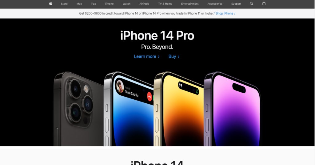
For example, Apple’s website is a great example of how negative space can be used to create a clean, uncluttered layout, and the company is well-known for its minimalist design aesthetic.
-
Streamlined Hero Sections
Hero sections are the large banner ads that appear just below the main navigation bar. Customers’ first impression of your site is crucial, so make sure it’s a good one.
There is usually too much going on in the hero area of many firms’ homepages since they want to provide as much information as possible to their visitors. Yet, groups have come to understand that overwhelming users with a variety of visuals, videos, headers, and buttons right away might be a serious UX design flaw.
Simplified hero sections with only the most crucial information are trendy in 2024 as a means of easing the client journey and improving site usability.
SaaS websites wanting to place the focus on their main product for conversion rate optimization will benefit greatly from this trend, however, e-commerce brands and creative agencies may find it difficult to simplify their hero sections due to the visual nature of their company.
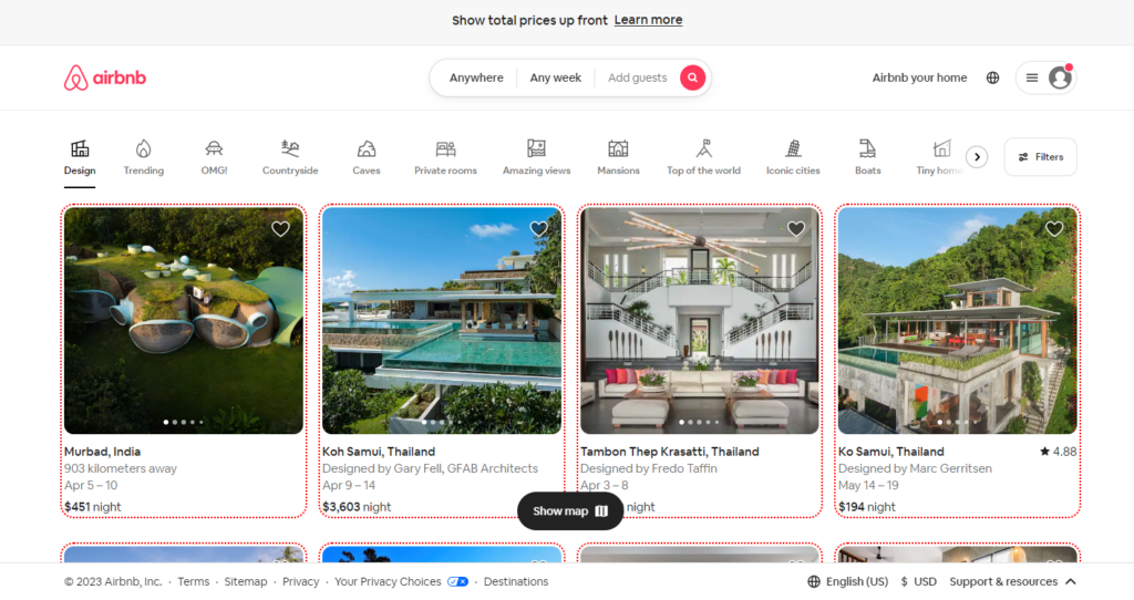
For example, Airbnb’s website features a streamlined hero section that highlights their primary offering: distinctive lodgings. Users are encouraged to learn more about the platform by the image and text’s simplicity.
-
Bold And Loud Typography
Simple text can be made into an eye-catching design feature by using a larger font size. It’s a hip approach to getting your website’s point out while also providing it with a distinctive, eye-catching look.
You can make a bold statement or take a more understated approach to the trend of using the extra-large font.
Instead of using pictures, you might try employing a catchy slogan to describe the most important thing your product does for customers. If you want your messaging to stand out and your UI to remain uncluttered, choose a high-contrast color scheme with a plain background.
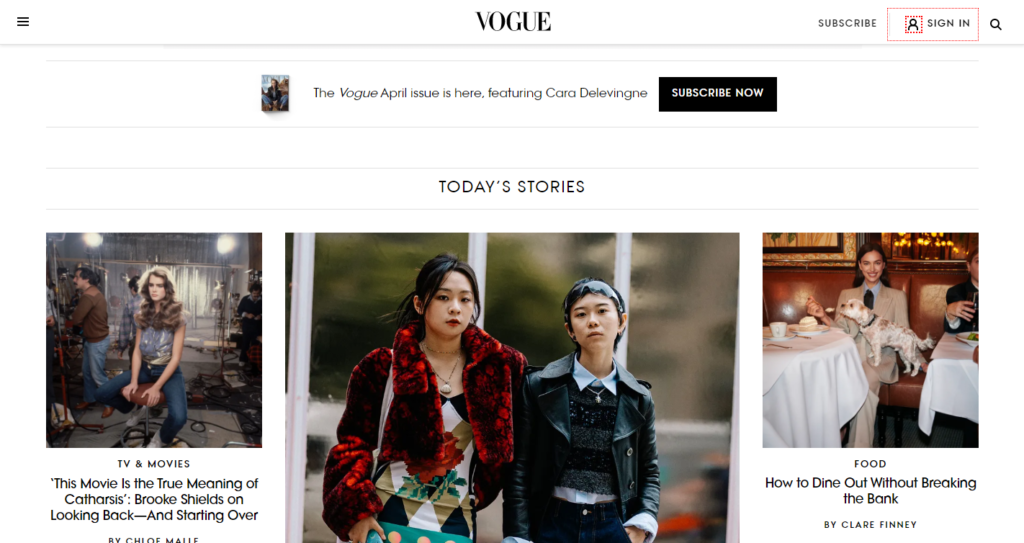
For example, To highlight editorial content and fashion trends, Vogue uses striking font throughout its website. To convey an opulent and aspirational atmosphere, the typography is frequently combined with high-end fashion photographs.
-
Nostalgic Design
Modern website design examples aren’t always about the future; sometimes it’s better to take a look back. In 2024, websites with a retro design aesthetic made a reappearance as a means of connecting with visitors on an emotional level by drawing on their fondness for the past.
Use these ‘good ol’ days’ references in your design to transport your audience back in time:
- Basic Geometry
- Artistic outlines
- The use of contrasting tones
- Typefaces with a vintage look
- Traditional patterns
- Animated depictions
The simplicity, clarity, and intuitiveness of the site’s navigation menu, search bar, and shopping cart icons will allow the retro aesthetic to take center stage. If your brand’s aesthetic or the product itself has a nostalgic feel, the nostalgic design will be more effective.
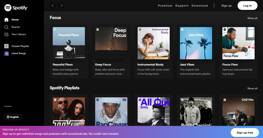
For example, Spotify’s website employs large, bold fonts to convey a sense of vitality and excitement about their music streaming service. The design is both memorable and interesting thanks to the clever use of typography in conjunction with humorous illustrations and direct language.
-
Collage-Style Graphics
Collages can be both aesthetically pleasing and functionally useful by allowing e-commerce Website designers to combine multiple photos into one cohesive design or user experience.
The hero section showcases an image composed in a collage approach. Images that overlap in a way that is both playful and futuristic, helping you accomplish your storytelling goals. The interface feels more alive and sophisticated thanks to the use of a wide range of colors, textures, styles, and shapes. For hero-section collages, pick images that represent your business and provide viewers with background information.
They take a more commercial, less creative approach to the collage format by including multiple calls to action (CTAs) within the various images.
A collage-style homepage layout idea is a terrific method to establish a powerful visual impression on users while keeping your site fresh and uncluttered, making it ideal for e-commerce and retail sites with multiple images to feature.
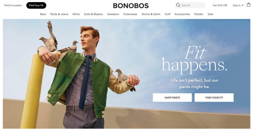
For example, On its homepage, Bonobos displays their men’s clothes assortment in the form of a collage. The logo combines graphics and text to highlight the many alternatives and variations offered by the company.
-
Horizontal Scrolling
While desktop browsers have traditionally only supported vertical scrolling, 2024 will see an increase in the number of web design modern that also supports horizontal scrolling.
By scrolling horizontally, users can have:
- Unique and unforgettable time spent on your website.
- Smooth navigation across a multitude of photographs
- An easy-to-use interface on touch screens and other mobile devices
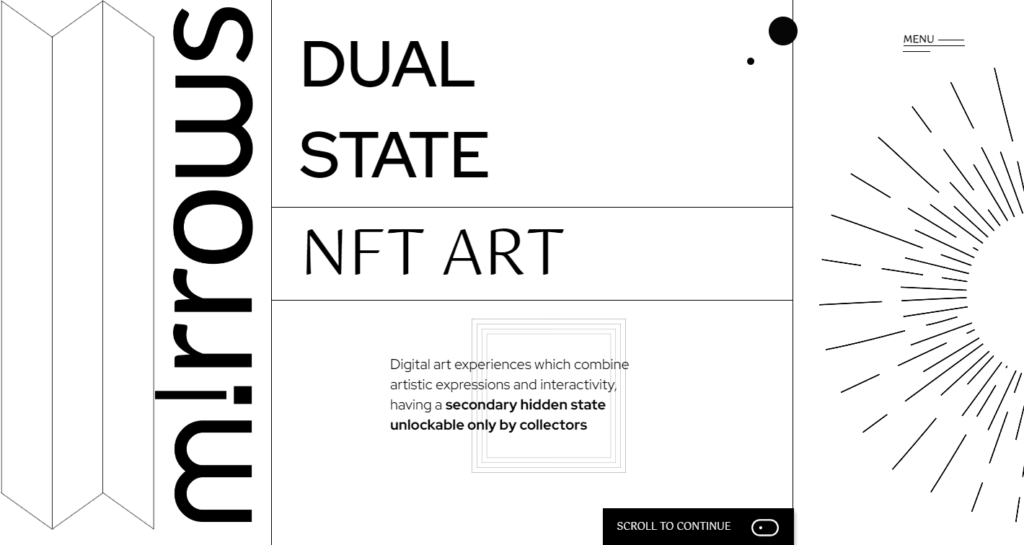
For example, Mirrows is a perfect example of a horizontally scrolling website that provides a captivating user experience that is rich in visuals and inventive typography. Horizontal scrolling provides the ideal platform for this design’s quirky sensibilities because it would be too overwhelming to navigate in a vertical space.
-
Smart Content Loading
Many of us may be guilty of having websites that are too resource-heavy due to the presence of several graphical elements and third-party integrations.
Thankfully, there is a wide variety of options for creating intelligent modern website designs that only download the content you need to view.
Both limitless scrolling and lazy loading have been around for some time. For years, this has been a staple of the best social media platforms, especially for their infinity scroll features.
Your website’s conversion rate and search engine ranking may increase as a result of these enhancements to the user experience.
With lazy loading enabled, a web browser (such as Chrome, Safari, or Firefox) will only download the visible portion of a page, saving precious server resources and preventing the downloading of unnecessary data.
For example, Facebook enhances site speed with intelligent content loading. Only a few posts are displayed at once as you scroll down your newsfeed. More posts are loaded as you scroll, but only as needed.
-
Geolocation & Browser-Based Content

It’s no secret that modern web design keeps track of your location and browsing history. Modern web design firms, however, would typically suggest their clients utilize “dynamic content,” or material that changes in response to a user’s actions or other information we have about them. not material that tries to be everything to everyone.
The best directories will also take into account your preferred cuisine. It makes it reasonable to give Italian restaurants more weight in search results if you have already rated or bookmarked them.
Another instance is the first time you log into your bank’s website when you are prompted to enter your username and verify your browser. When you return, the bank will have a record of who you are and whether you’re an individual or a business. According to your customer type, they will therefore push either their home or business products and web development services.
E-commerce trending web design operators should prioritize personalized content more heavily. Online retailers have found that showing customers things they have recently interacted with increases sales.
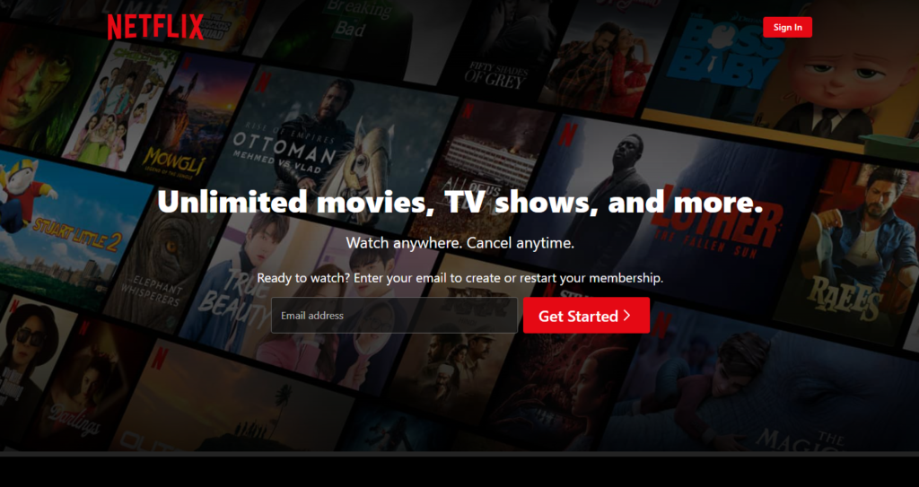
For example, Netflix tailors its service to each individual by delivering media directly to their browser. To make recommendations for content you might enjoy, the website uses data about your browser and viewing history.
-
Voice-Activated Interface
People are increasingly using voice search by asking questions or making demands rather than typing in search terms. This indicates that websites are evolving to accommodate the growing popularity of voice chatbots and other forms of virtual assistance. While a voice-activated interface isn’t yet the norm for most websites, it’s not likely to disappear anytime soon.
It’s only a matter of time before websites offer voice search in addition to standard text search.
For example, Domino’s Pizza has a voice-activated interface that enables customers to place orders by simply speaking into the device. On some smart speakers and Domino’s mobile app, the interface is accessible.
-
Interactive Websites
Interactive websites are becoming increasingly popular because of their obvious benefits for brands and enterprises, and their close connection to the extremely immersive nature of virtual reality and augmented reality.
With the advent of interactive websites, visitors can participate in the online experience in unprecedented ways. Interactive websites create an immersive experience for users by constructing an interesting setting with the use of interactive elements like sliders, maps, filters, drag-and-drop capabilities, scrolling animations, and interactive forms.
This modern creative website design improves user stickiness and may even increase conversions. Websites that encourage participation from visitors are more likely to increase user retention, which is good for search engine optimization. As the year progresses, we anticipate more sites to incorporate interactive aspects, which can be easily adapted with no-code tools or website themes.
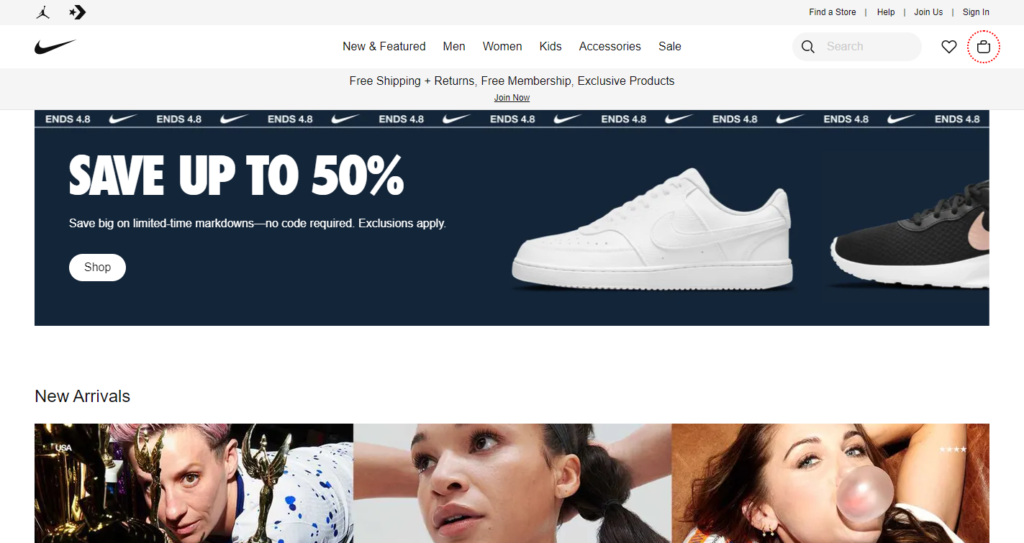
For example, On the Nike website, there is a builder that lets you make your pair of shoes from scratch.
-
Virtual Reality
In the next years, more and more design trend websites will offer virtual reality experiences. Online rental viewing platforms such as Airbnb are one example. Or the site’s capacity to display how a sofa might appear in your room.
Virtual reality (VR) has the potential to be a game-changer when it comes to the method by which a website presents information to a visitor to influence their purchasing decisions.
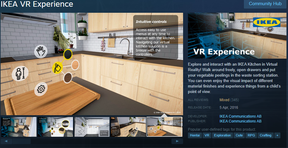
For example, The IKEA VR Experience lets customers virtually shop for and decorate rooms with IKEA’s wide selection of home goods. The virtual space is fully immersive and allows users to move around and interact with it.
-
Micro-Interactions
Micro-interactions are little animations on a website that gives consumers subtle feedback. A frequent micro-interaction is the transformation of a link’s color when the mouse hovers over it. The same experience may be given more attention to stand out in light of the recent emphasis on micro-interactions. As you browse down the page, the colors in the gradient will gradually change, and when you click on an element, a burst of color will burst forth from your mouse. These are the kinds of sophisticated micro-interactions that are becoming increasingly common.
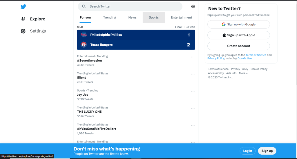
For example, Twitter displays a tiny animated heart as a visual cue that a user has “liked” a tweet.
-
Smart Video
Websites with video have long been considered essential in the online world. Because of how interesting trends in web design they are, videos are quite popular. It’s the best online advertising medium available today.
The video is fantastic, but it requires planning. This is the essence of “smart video”: meaningful and functional media. The days of throwing a YouTube video on your site because you can are over. A single high-quality video with careful planning and execution is superior to a dozen poorly made ones.
For example, Netflix’s smart video technology allows the streaming service to make tailored recommendations to each user based on their viewing habits and interests. The system uses the user’s preferences and viewing habits to recommend content they are more likely to like.
-
Material Design
Google first announced the material design language in 2014. The standard web design is boring and lifeless. To achieve this “material” look, designers use color and lighting to simulate the textures and materials found in nature.
Icons for Google’s software suite are a great representation of the material design. The Gmail envelope and the calendar are two examples of material design done well. It’s a subtle touch, but it helps the symbols stand out.
-
Text-Only Hero Images
To attract more readers, newspapers always place the most interesting and relevant stories “above the fold.” On a website, this would be the “hero section” at the page’s top. Web designers are ditching hero images in favor of bold typography to attract the attention of consumers who are constantly inundated with content. It may be necessary to grab the user’s attention quickly, and a font that stands out can do just that.
-
Dark Mode
There are a few reasons why you would choose to use a dark theme for your website. In terms of everyday use, they alleviate eye strain, which is a growing problem as our culture becomes increasingly reliant on electronic devices. Aesthetically, dark mode is a great way to give your cool website design ideas a cutting-edge feel while also allowing you to draw attention to specific areas of the design by making them stand out against the background.
For example, Users can choose to use YouTube’s dark mode in their preferences. By switching the platform’s background color from white to black, this feature makes it easier to watch videos in low-light settings and lessens eye strain.
-
White Space
White space is used to give content breathing room rather than to maximize the amount of data displayed. Your site’s visitors will have a more pleasant experience, the material will stand out more clearly, and reading will be easier.
The word “white space” simply refers to the empty area we leave between various components. It can be any color other than white, as long as there is nothing there. For this reason, it is sometimes referred to as “negative space.”
-
Data Visualization
Providing information in an engaging way is challenging. Data visualization, however, is worth the trouble because it effectively conveys information while also taking use of the fact that humans are visual creatures. By turning your data into eye-catching visuals, data visualization increases the likelihood that your audience will keep reading about your company. Popular methods of visualizing data include infographics and graphs.
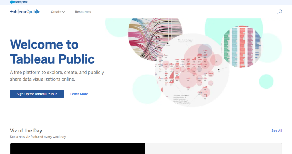
For example, Tableau Public is a data visualization platform that enables users to create and share interactive charts, maps, and graphs online. To assist users in developing engaging visualizations based on their data, the platform provides several tools and templates.
-
Frosted glass effects
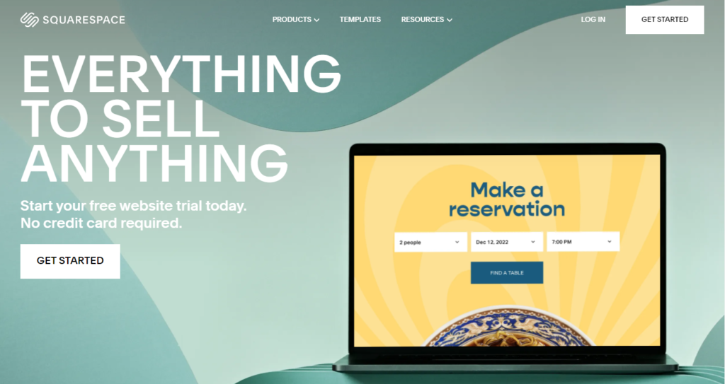
Because of recent advancements in the latest trends in website design, the frosted glass effect may now be easily implemented on websites. Color is added to a space while still being legible thanks to the frosted glass overlay’s hazy appearance of elements behind it.
As an alternative to gradients, the effect has become increasingly common as a background choice for designers.
For example, Several parts of Squarespace’s website, including banner ads and the menu bar, have a frosted glass effect. This effect not only makes the design more appealing to the eye but also gives it a sense of depth and dimension.
-
Non-Traditional Scrolling
Websites experiment with various scrolling methods to provide their visitors with a one-of-a-kind experience. Vertical scrolling is the standard user experience. It scrolls horizontally. It’s an innovative approach to user experience design that manages to be both simple and effective for end users.
-
Gradient Color Schemes
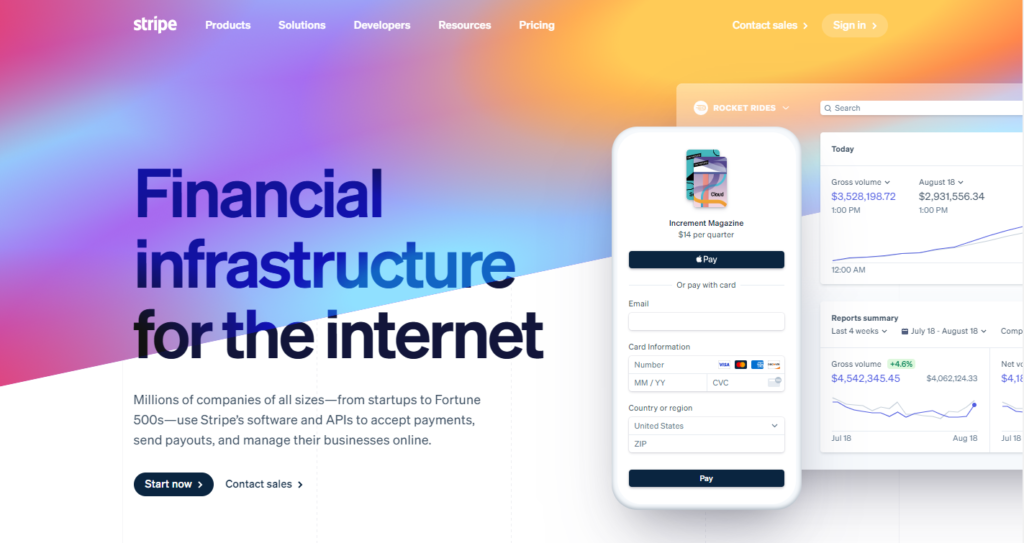
Now more than ever, web designers are turning to gradients when they need fresh ideas. ColorSpace, a website offering gradient designs and a tool for generating gradients and color palettes, was launched in response to this trend. This makes it easy to build your distinctive design.
For example, The login screen and other sections of Stripe’s website use a gradient color scheme. This approach adds a layer of visual intrigue to the design while also giving it a sense of depth and substance.
-
Organic Shapes
Without altering the content’s presentation, organic shapes can offer levity.
These are the most cutting-edge practices that have recently gained traction among web designers and developers. While geometric designs were popular up to 2020, today’s web design trends are all about organic or fluid forms. Natural forms like rivers, mountains, and raindrops could inspire such asymmetrical forms.
Personality can be added to material without detracting from it through the use of organic shapes. It’s a minimalistic approach that gives the site an old-fashioned feel.
-
Thumb-Friendly Design
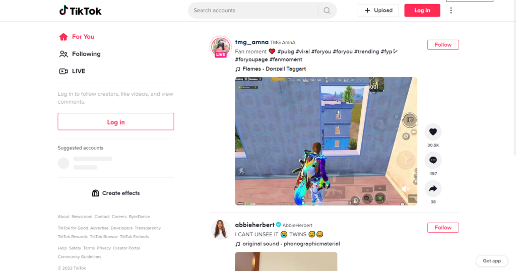
Figures suggest that 54.8% of global website traffic originates from mobile devices. The revolutionary improvements in mobile technology in recent years have compelled all businesses to develop mobile-friendly websites. Still, catering to mobile users isn’t enough.
If you look closely at how you hold or use your phone, you’ll notice that your thumb does all the work. The site’s design must accommodate thumbs in this instance. Your website’s iconography, menus, and buttons are all thumb-friendly.
For example, The primary controls for the TikTok app are located at the bottom of the screen, making them easy to access with your thumb. Users can easily use the app with a single hand thanks to its design, and they can also swipe up to access additional material.
-
Website Load Speed
Websites that take too long to load will never be considered modern or stylish. Seventy percent of users responded that page load times affect their decision to buy from an online shop. Of course, people do not rate your website based on its speed, but their subconscious thoughts do.
-
Chatbots
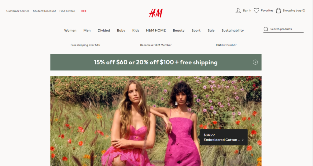
Consumers today want their online talking and assistance to be as involved and intelligent as possible. Web developers are turning to sophisticated chatbots to handle customer support inquiries made through websites.
Remember that the next time you hear a humanlike voice on a website, it’s probably just a chatbot. You might think you’re corresponding with the genuine article, but you’re not. Chatbots improve your website’s responsiveness and interactivity and speed up the rate at which it returns results.
For example, H&M’s website features a chatbot designed to assist shoppers with navigating the site and making purchases. Natural language processing is used by the chatbot to interpret user inquiries and deliver relevant responses.
-
AR & VR
As the metaverse gains traction, augmented and virtual reality become more crucial to consider while designing a website. How to find a website designer who has a one-of-a-kind opportunity to grab people’s attention by taking advantage of these fast-developing technologies.
Since virtual reality gives businesses a better handle on how their customers engage with their websites and goods, it is being used by businesses across a wide range of sectors. Businesses can effectively engage customers on their websites through the use of virtual reality by creating an immersive experience, which has been shown to enhance customer retention, satisfaction, and sales.
With the help of AR and VR, we can provide people with new ideas for website designs to have fun and alter the way they interact with the world.
-
Anticipatory Design
Another webpage design idea to improve the user experience is to plan for the demands of the target demographic. Adding interesting and fun details that are specific to the individual is a key part of this.
In both online and product design, the anticipatory design improves the user experience. Every day, humans must make dozens of choices, such as what to wear, what to eat, which path to take, etc. We expect instantaneous relevance in our online searches, whether for music on Spotify, an item on Amazon, or a film on Netflix. These services learn from our preferences and then make suggestions that help us avoid decision fatigue.
Netflix’s recommendation system exemplifies the company’s dedication to and appreciation of its audience. The streaming service keeps track of the content you watch and your tastes, allowing it to personalize the recommendations it makes when you log in.
Spotify does the same thing with its Your Time Capsule feature, a curated playlist full of songs from when you were a teenager.
Meanwhile, Google Maps facilitates travel from point A to point B by providing numerous routes to the destination (including an option to take the most fuel-efficient route) and displaying contextual information at regular intervals.

Conclusion
Businesses that want to succeed in today’s digital marketplace must-have modern website ideas. To make a website that not only looks amazing but also provides an optimal user experience, it is important to stay ahead of the newest trends and best practices in web design.
- Bold typography
- Minimalism
- Dark mode
- Interactive elements
- Custom illustrations and graphics
- Responsive design
You can accomplish these aims with the help of some of the more cutting-edge principles of web design trends. Using these tips might make your website more noticeable and improve the user experience. Websites also need to be fast, accessible, and SEO-friendly for the best possible exposure and participation.
Always keep an open mind and be willing to change as the web design landscape and best practices shift. You may make a website that is up-to-date and useful for your purposes if you keep up with the times.


